CPH SAFETY TRAINING



DETAILS
Background
CPH Safety Training is a professional safety training company based in Hull, UK. They specialise in providing safety training services focusing on forklift trucks, telehandler lift trucks and more.
The brief I received from CPH Safety Training was to produce a new Squarespace Build and using Print Design to create a set of business cards.
The brief I received from CPH Safety Training was to produce a new Squarespace Build and using Print Design to create a set of business cards.
INVOLVEMENT
For the Squarespace Build, I worked closely with the client to understand their requirements for the project. Initially starting with a kick-off meeting to discuss the goals for the website, I then put this into practice by producing a sitemap and wireframes to map out the website.
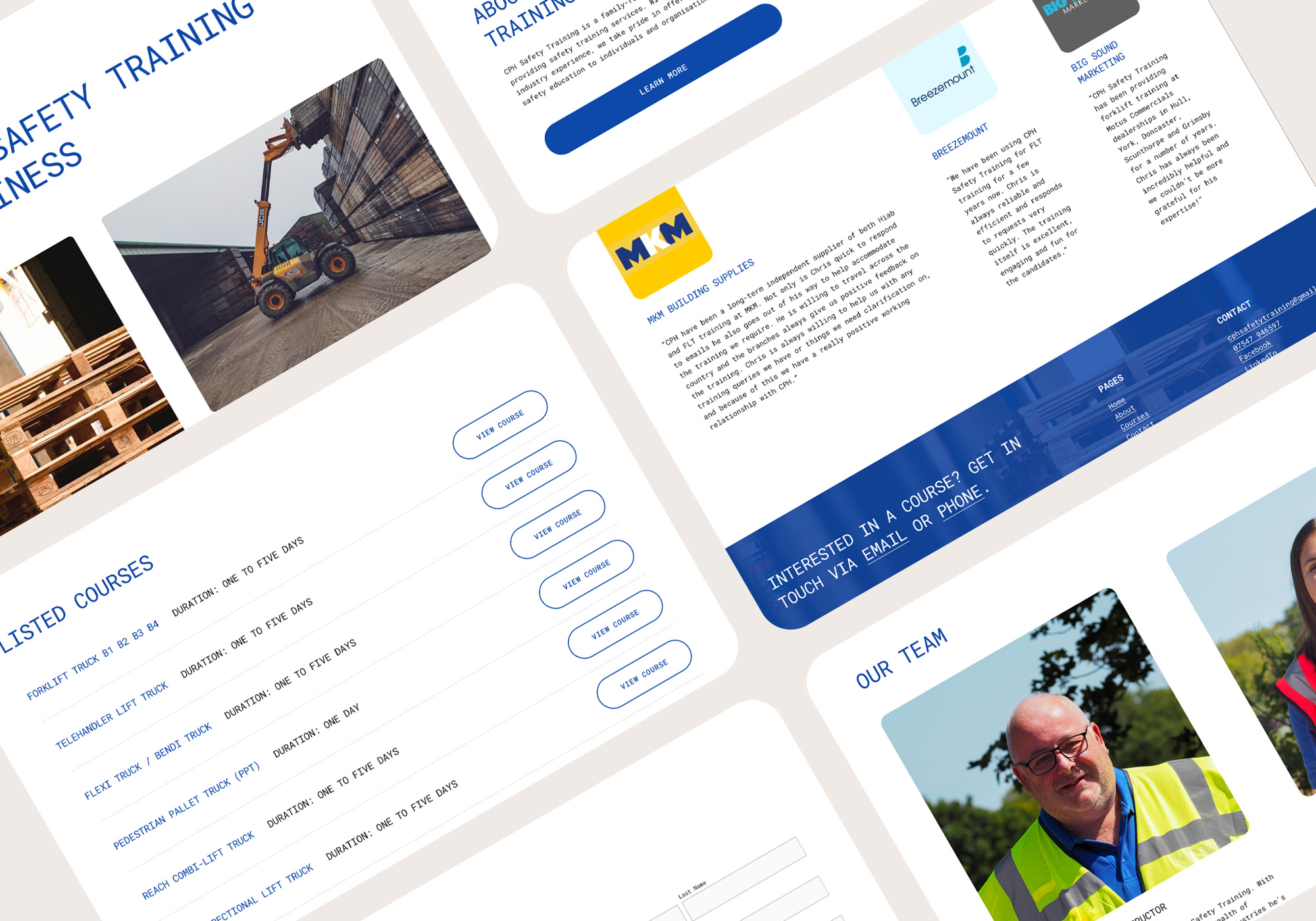
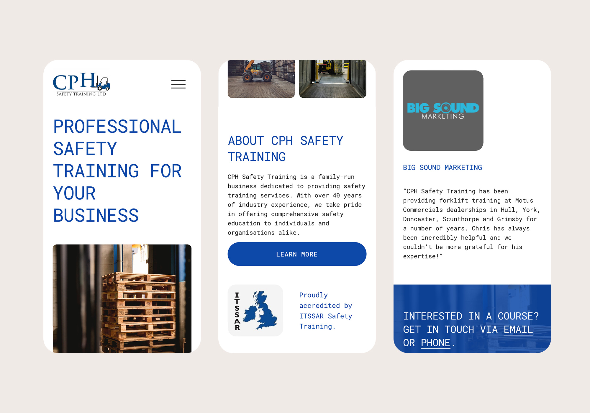
After signing off on the approach from a user journey point of view, I then created a layout on Squarespace based on my wireframes. The Homepage showcases photography of their subject matter, a snippet of information about the company, prominently showcasing their accreditation with ITSSAR Safety Training, listed courses and reviews. The supporting pages displayed are an About page with information about the company and members of staff, Listed Courses with links through to the course pages that showcase all the relevant details, Contact Details and Social Links.
With regards to the visual side of the project, I came up with a minimal colour palette that was complimented by the brand identity colours of blue and a strong use of photography throughout. I used a white background for the body of the website with flashes of blue throughout for typography, CTA buttons and the website footer. Using an uppercase mono font styling for any heading to bring prominence to each section, as well as utilising subtle transitions when navigating between pages and scrolling within.
With regards to the visual side of the project, I came up with a minimal colour palette that was complimented by the brand identity colours of blue and a strong use of photography throughout. I used a white background for the body of the website with flashes of blue throughout for typography, CTA buttons and the website footer. Using an uppercase mono font styling for any heading to bring prominence to each section, as well as utilising subtle transitions when navigating between pages and scrolling within.
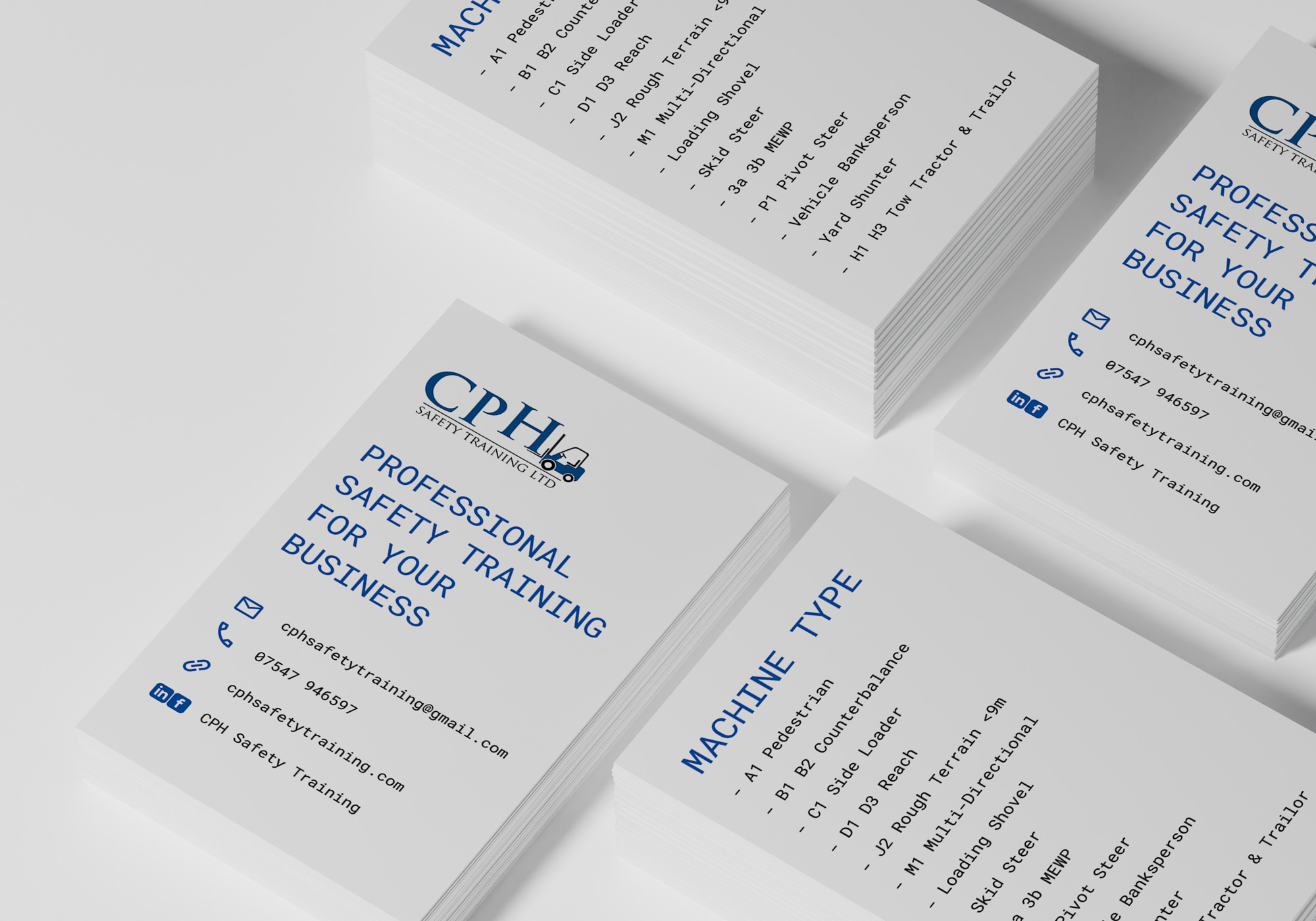
For the print design, I worked on a set of business cards to aid with promoting their business. The business cards follow the same styling from the website to keep consistent across all mediums. The front showcases the company brand identity, strapline and contact details, the back showcases the machine types in a listed format.
LET'S CHAT
Are you interested in working with me? Send me a message on contact@davidadamjones.co.uk or direct message me on the links shown in this footer. You can also download my CV if you'd like to know more.